

1
2
3
4
5
6
7
8
9
10
11
12
13
14
15
16
17
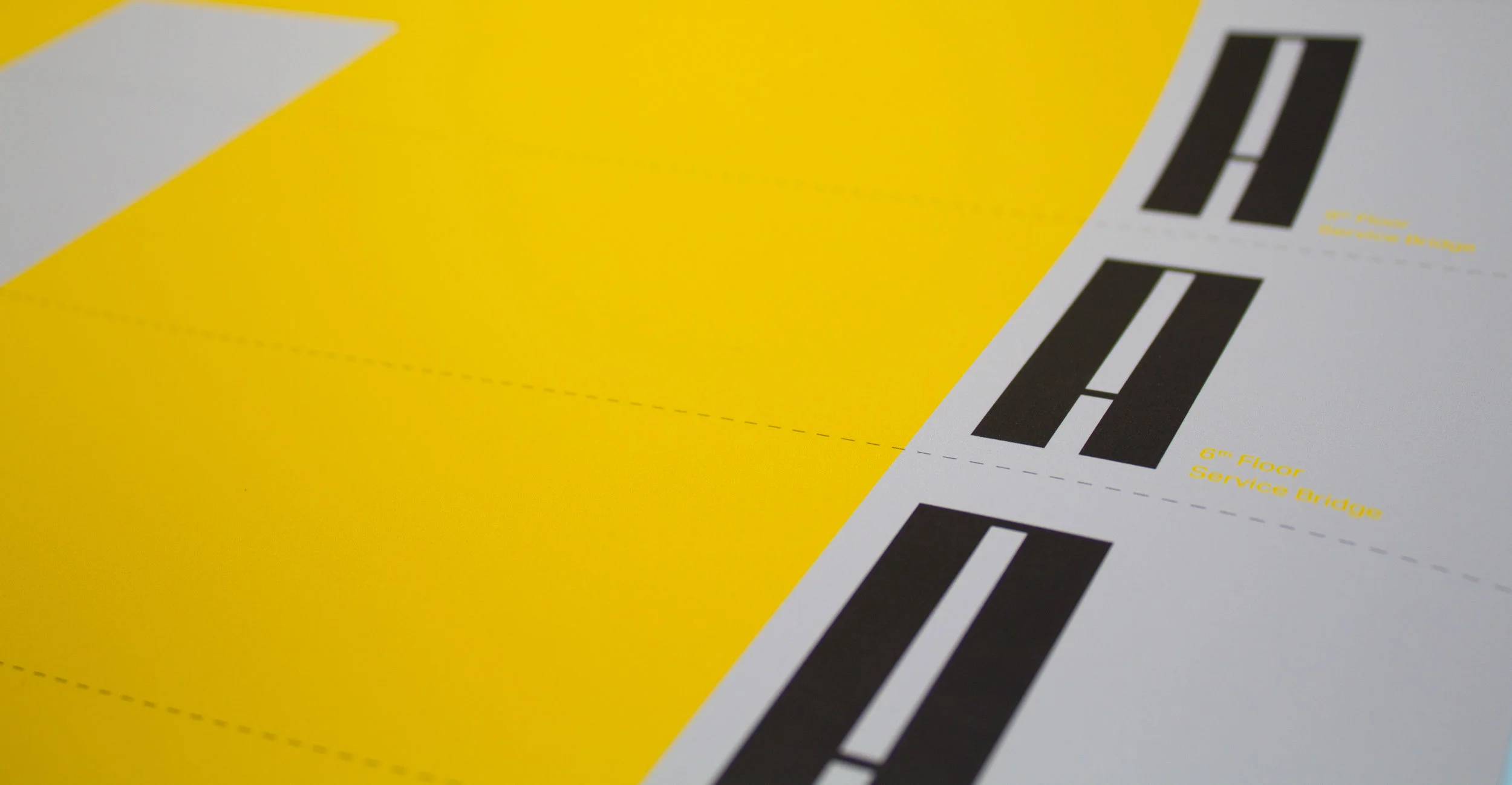
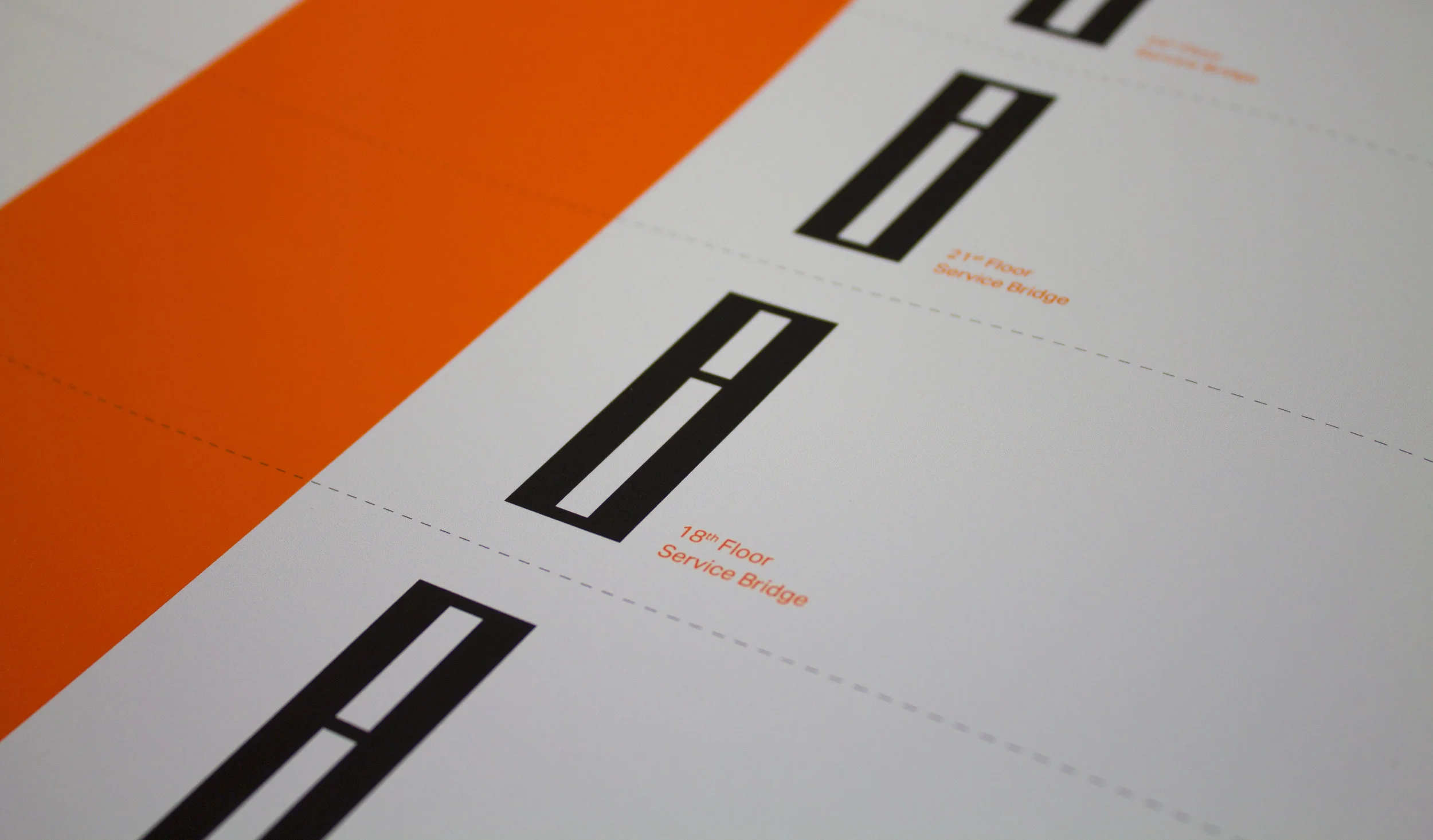
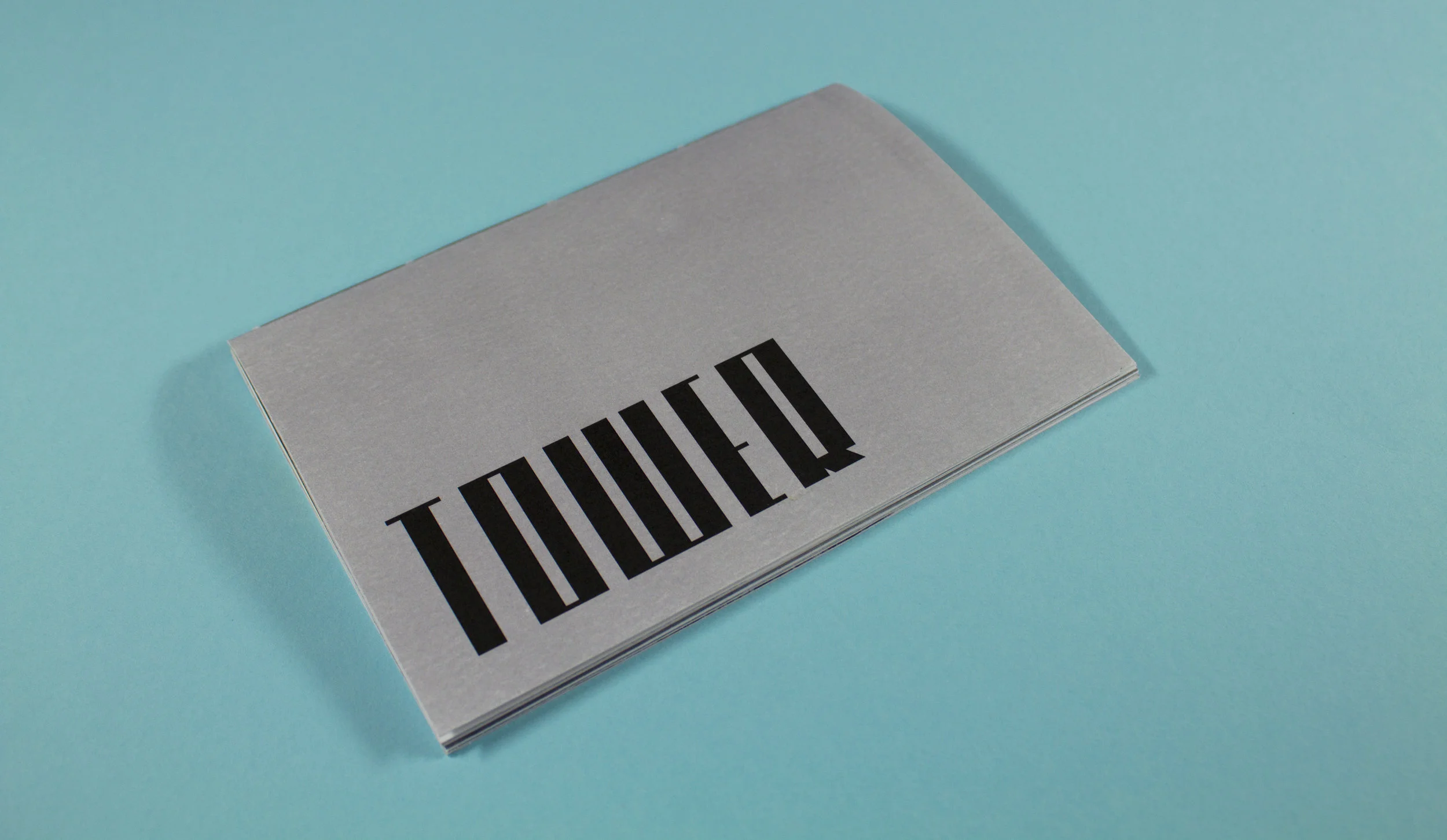
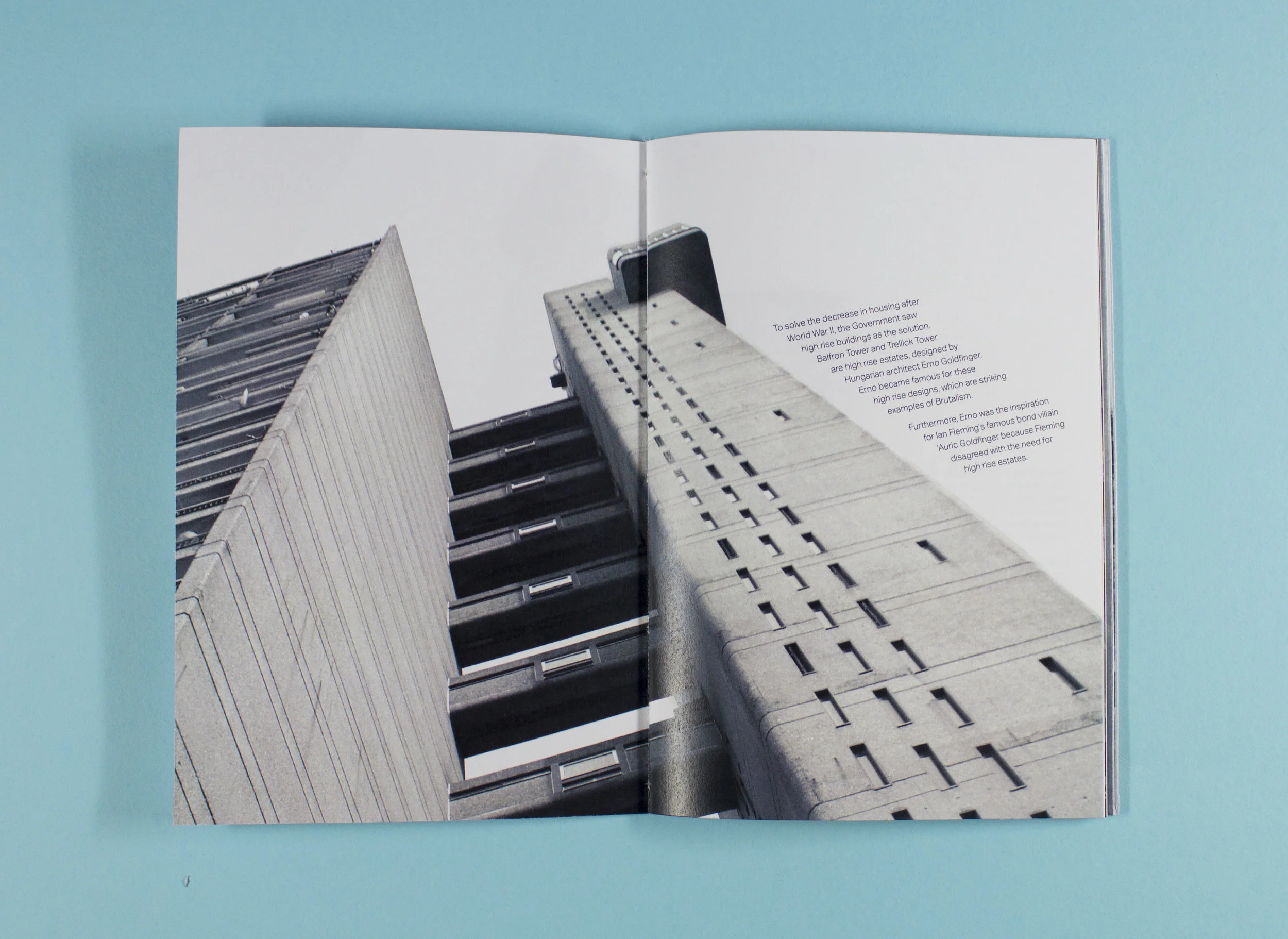
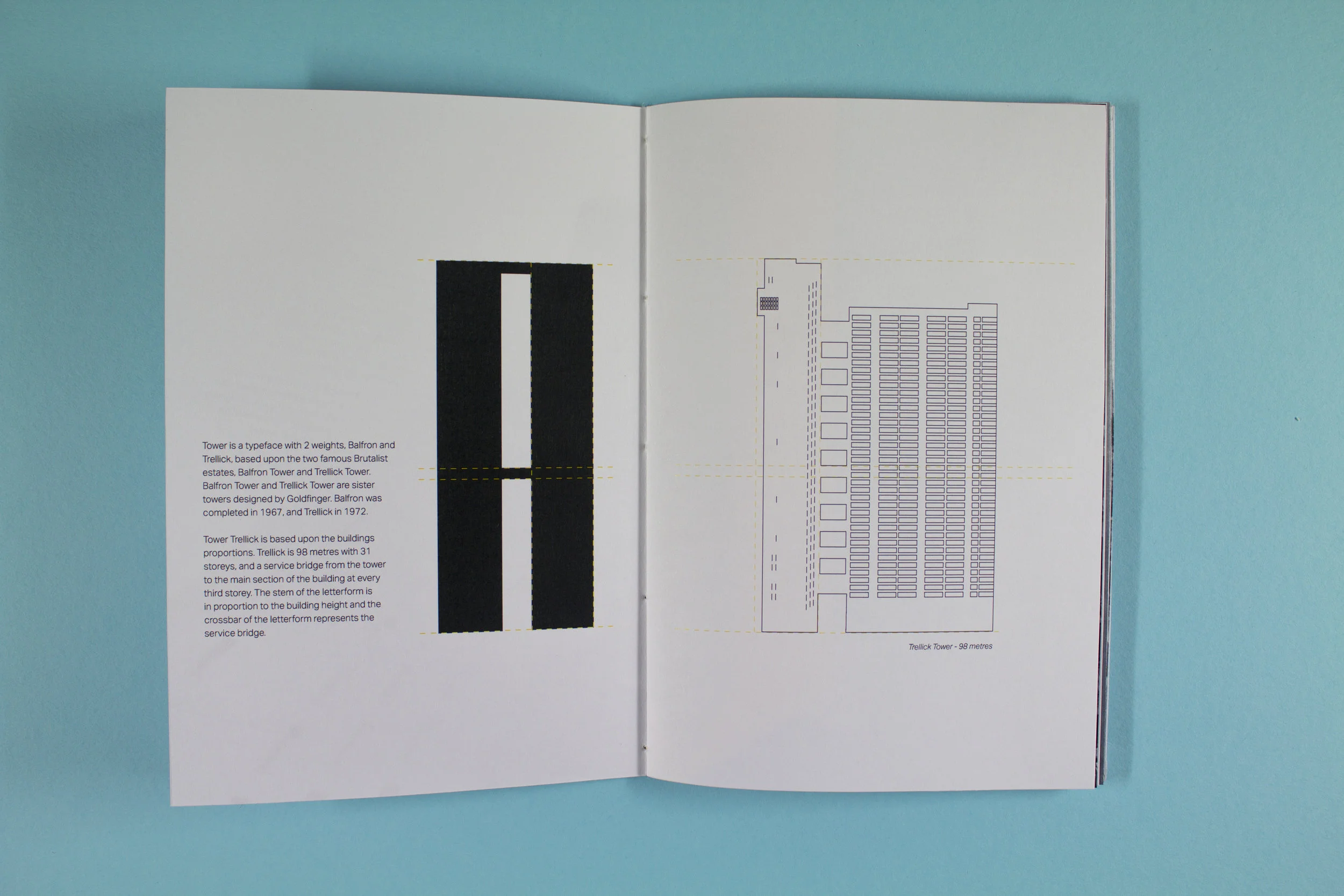
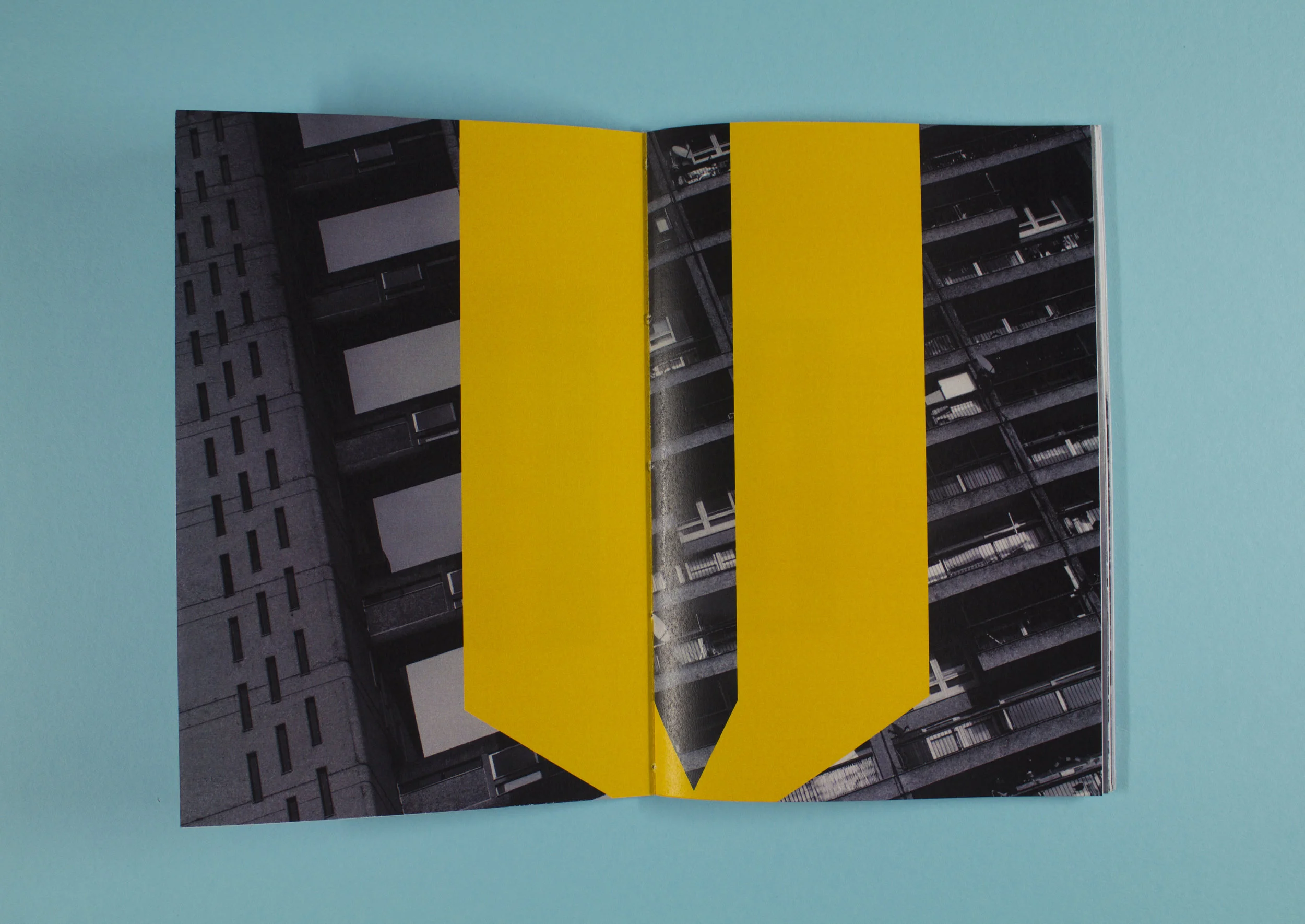
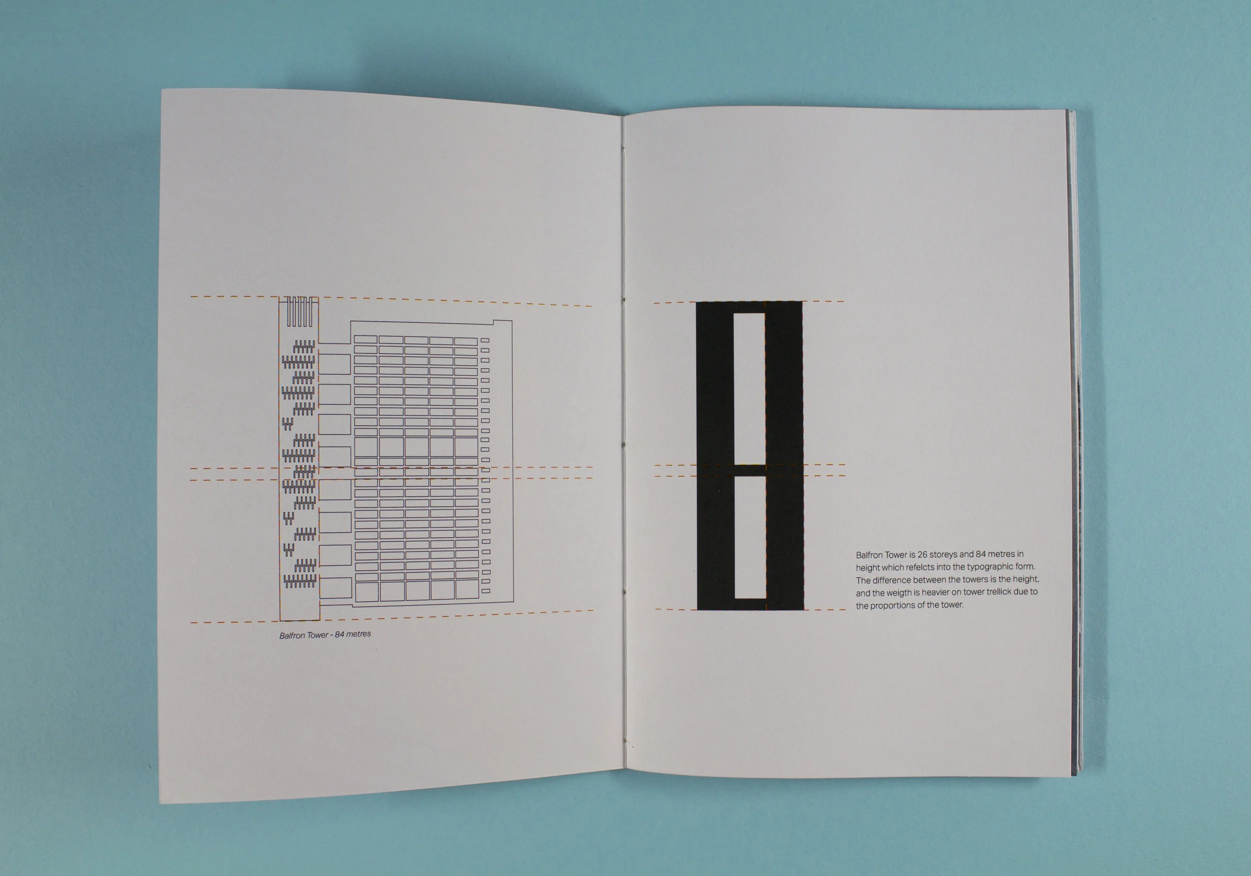
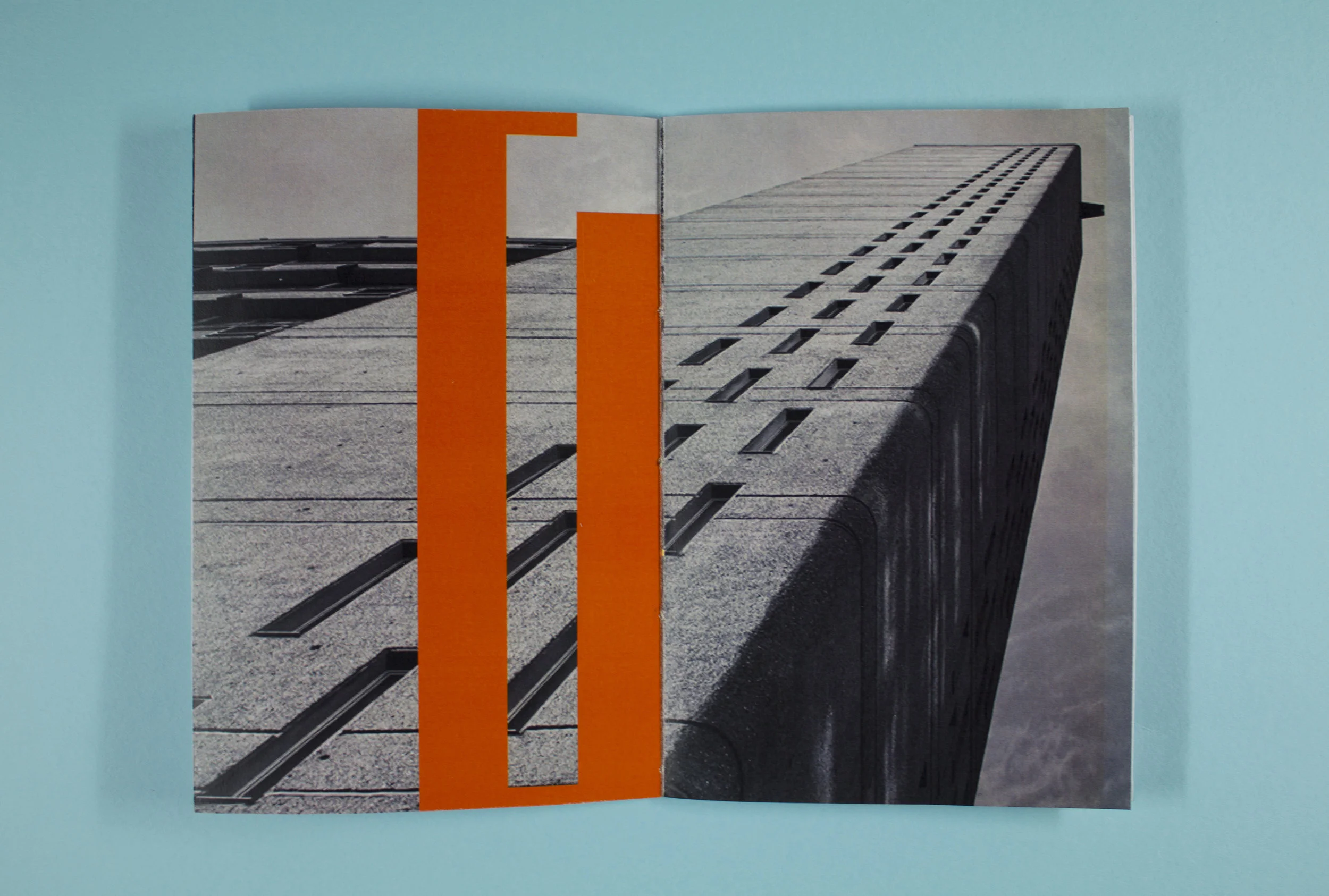
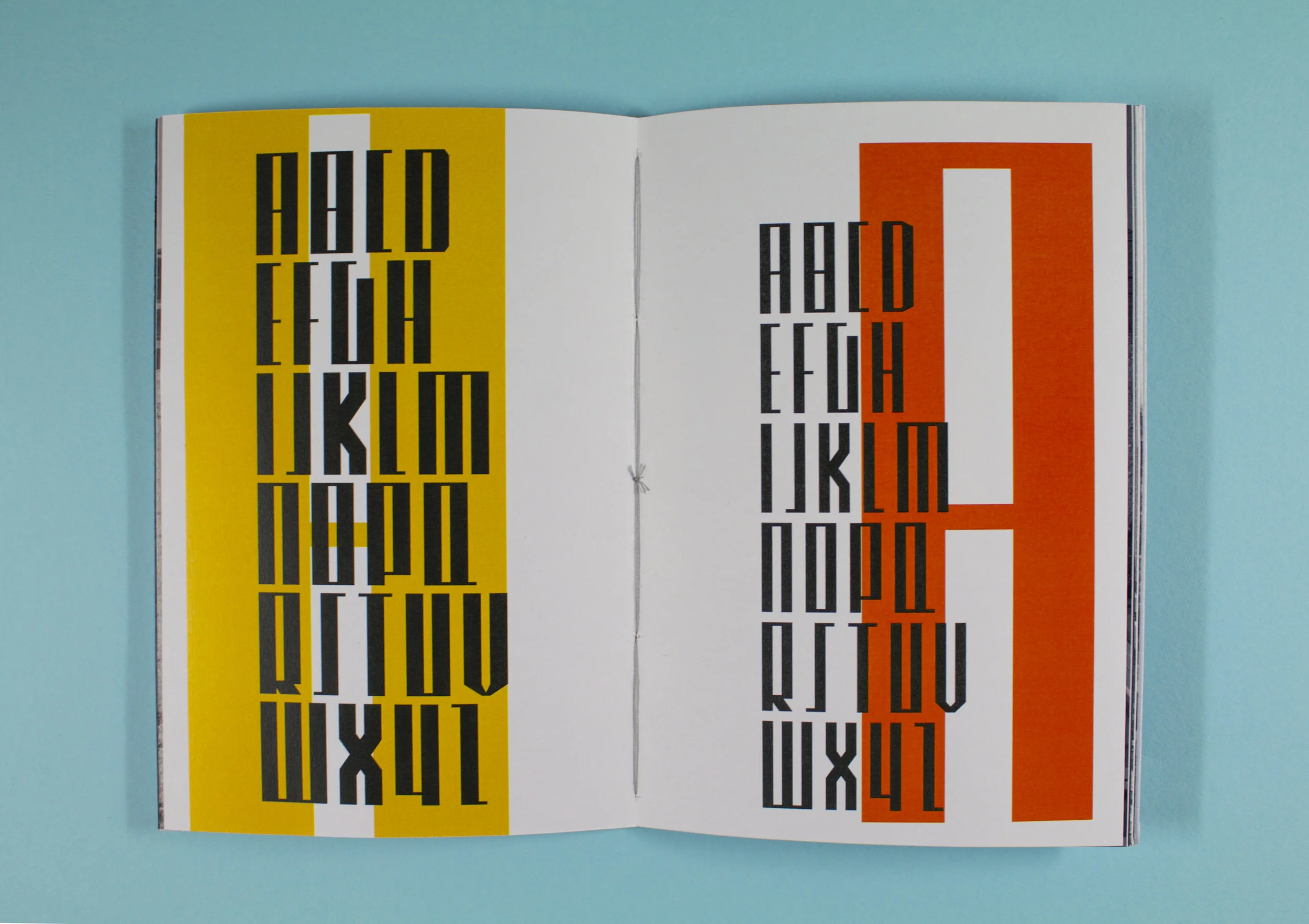
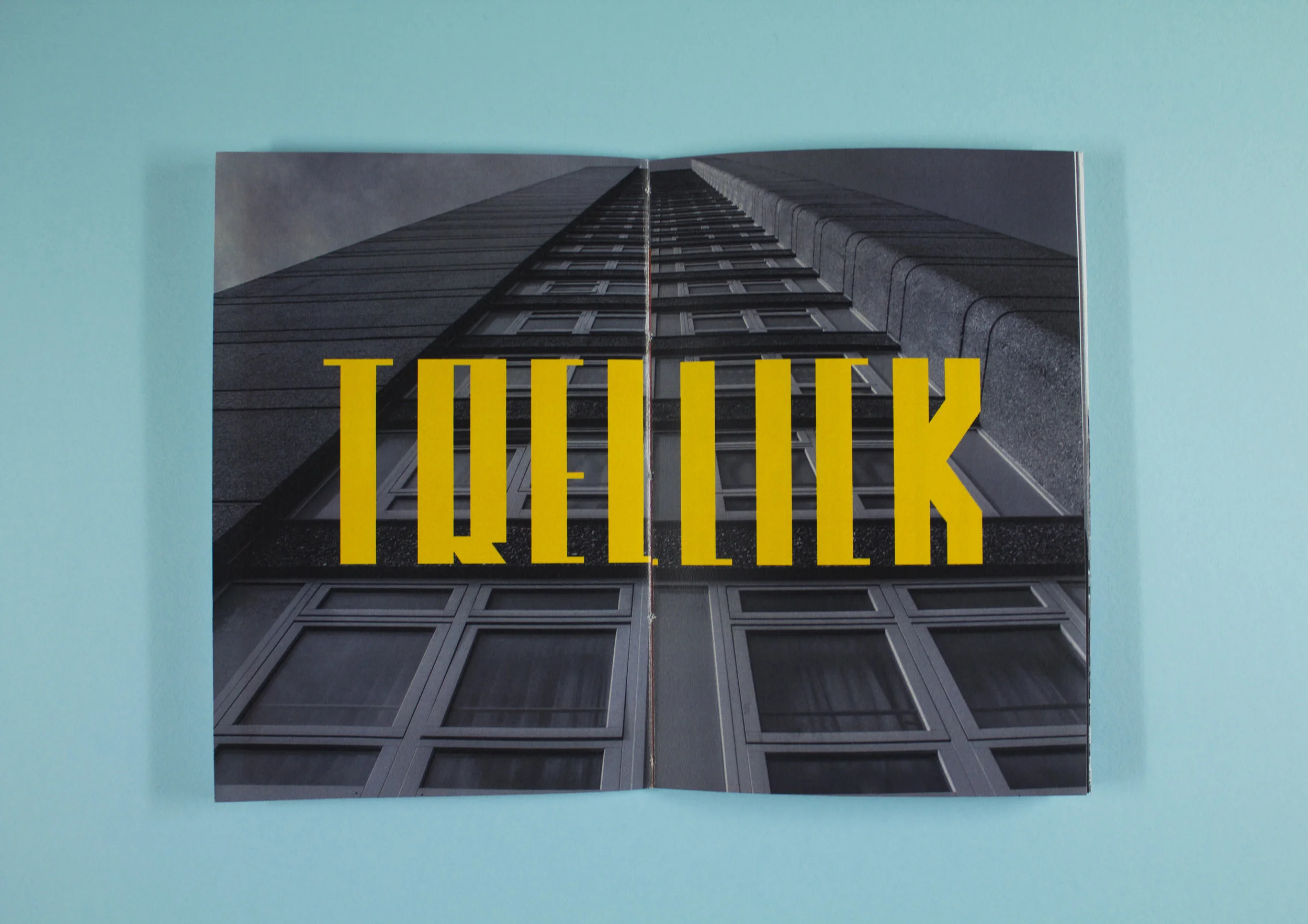
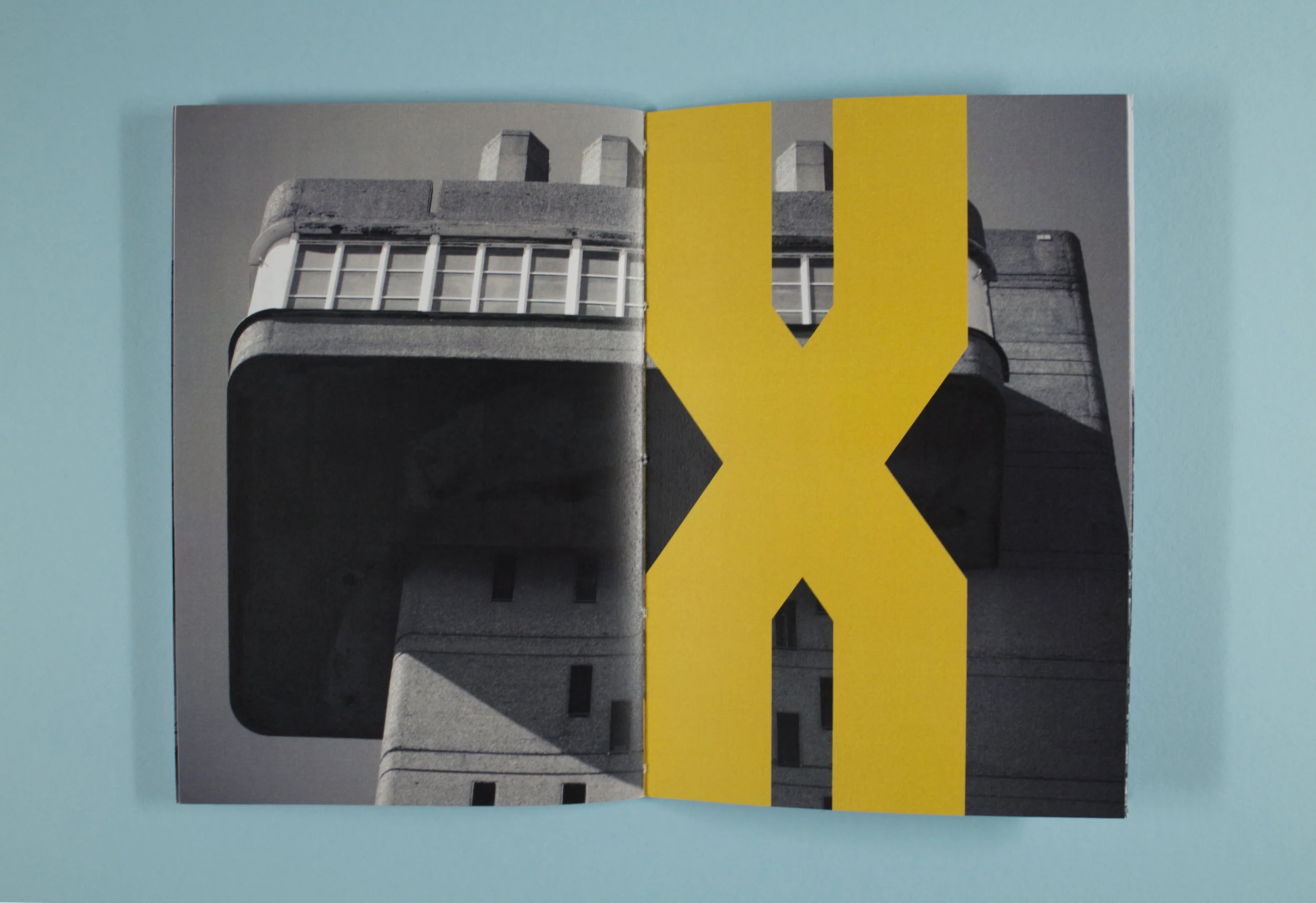
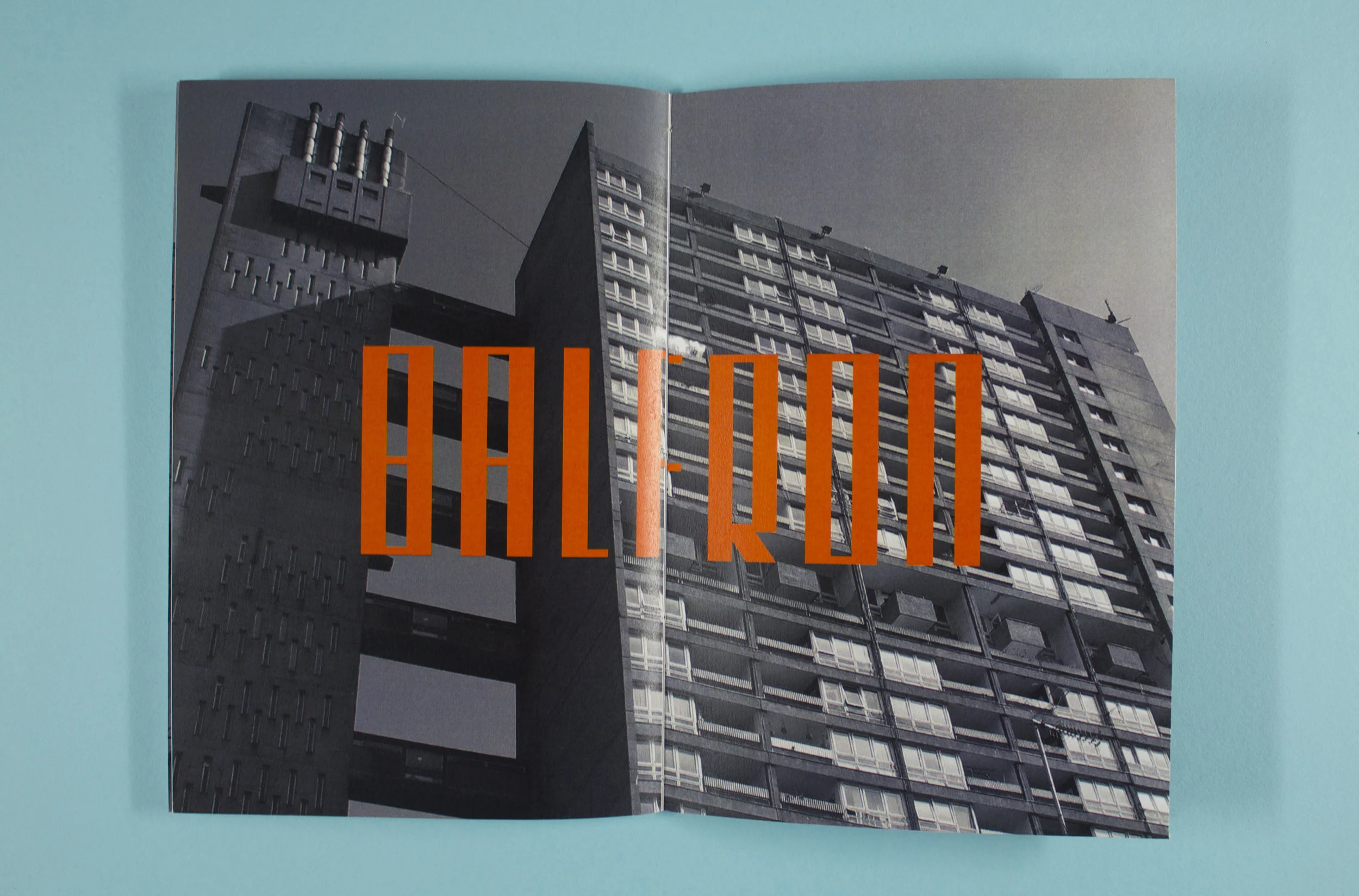
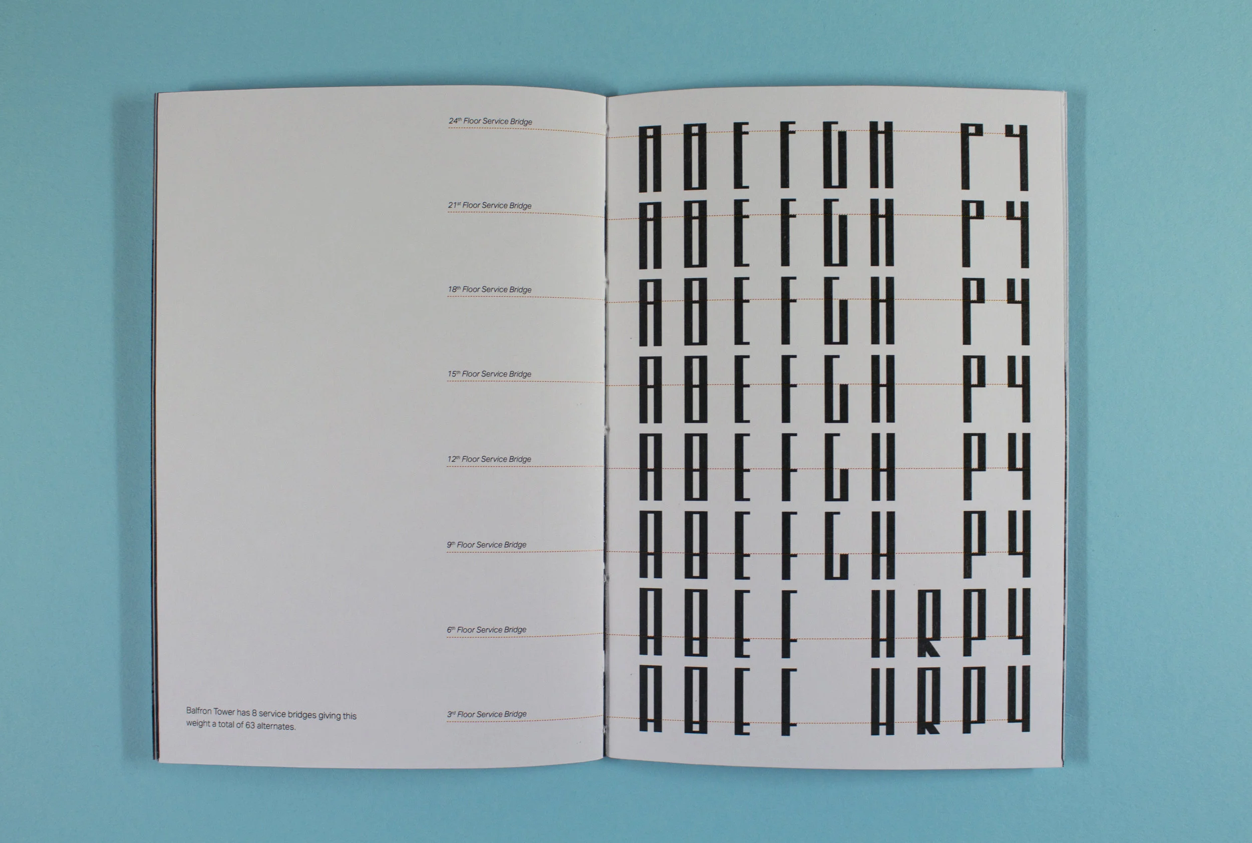
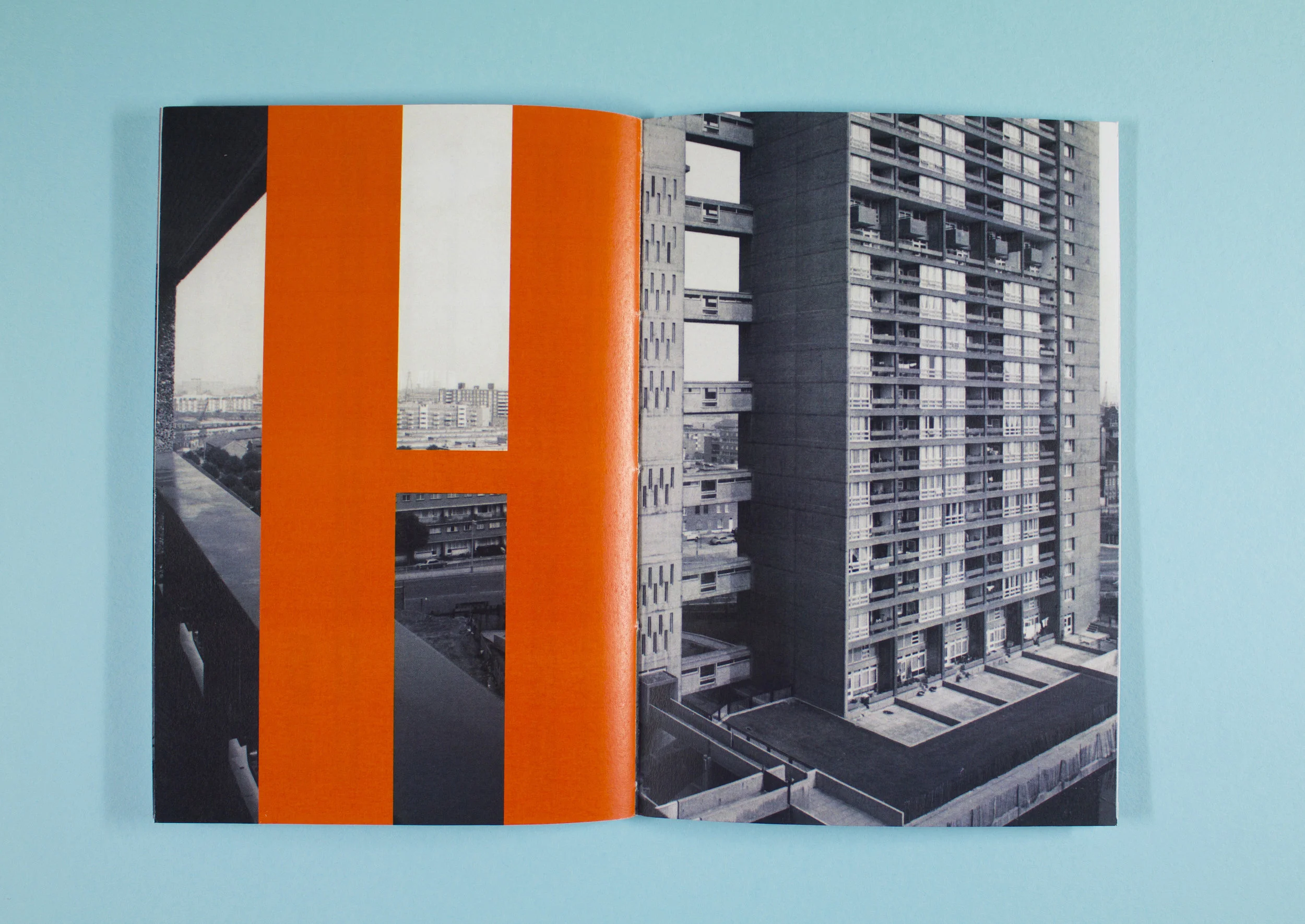
Tower typeface is influenced by the proportions of the sister brutalist buildings, Balfron & Trellick Tower, designed by Erno Goldfinger. Through this investigation, the outcomes were: a typeface with two weights, type specimen posters and a type specimen book.
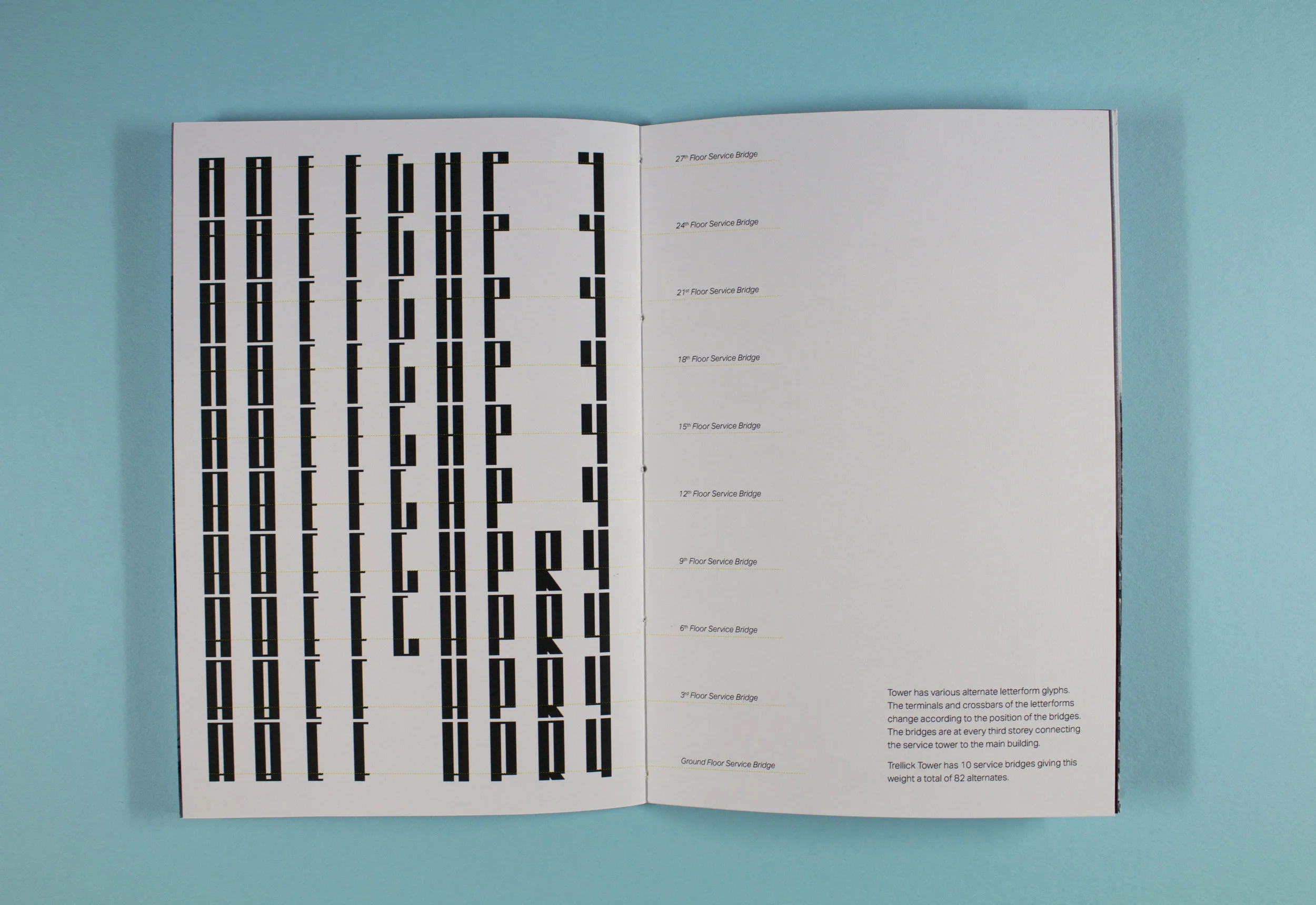
Type specimen posters showcasing the two weights. Crossbars or terminals change according to the service bridge on every third floor. Type specimen book detailing the typeface. The design reflects the dynamic nature of the Brutalist movement.